Wouldn’t you love to go on a coffee shop tour of the whole United States?
There are certain things that every coffee shop website should have, but that still leaves a lot of room for personalization and design.
We always talk about how your coffee shop’s website is its virtual front door. So we visited hundreds of virtual front doors of coffee shops all over the country. During our journey, we noted a coffee shop website in each state that we thought could help inspire your own website’s design.
This isn’t just a list of different website templates that you could use for your coffee shop website. These are real websites for real coffee shops. So, without further ado…
Here is our list of 50 coffee shop website designs to Inspire you. It’s in alphabetical order just to make it easier.
Coffee shop website inspiration from all 50 states
Alabama- Domestique Coffee
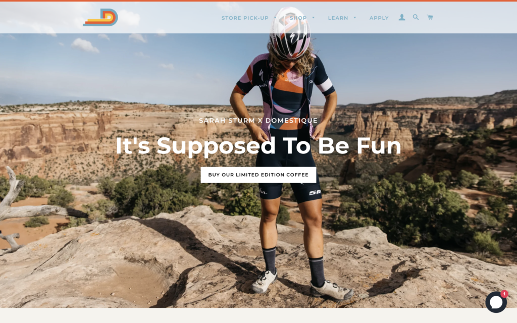
Domestique defines itself as “a coffee, hospitality, and lifestyle company that provides coffee-based cultural experiences.” They have four different shops throughout Birmingham and Homewood, Alabama. We’re fans of the bright colors and clean layout of their website. The call-to-action button in the middle of the hero section is a great addition that prompts visitors to take valuable action.
Alaska- Boom Coffee
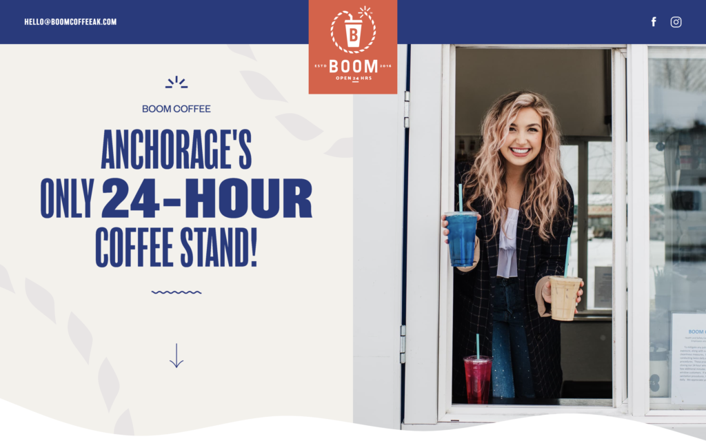
Boom Coffee is a 24-hour coffee stand in Anchorage, Alaska. They pride themselves on their exceptional coffee and exceptional baristas. Their one-page website is full of bright colors and engaging imagery. It’s always a good idea to go with custom photography rather than stock imagery. Boom Coffee knocked this out of the park.
Arizona- Fourtillfour
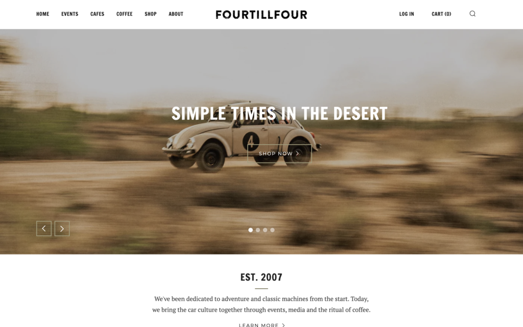
Fourtillfour is a lifestyle brand bringing car culture together through events, media, and the ritual of coffee. Their flagship cafe is located in Scottsdale, Arizona. Their website takes advantage of e-commerce which allows them to reach customers across the country.
Arkansas- Mylo Coffee Co.
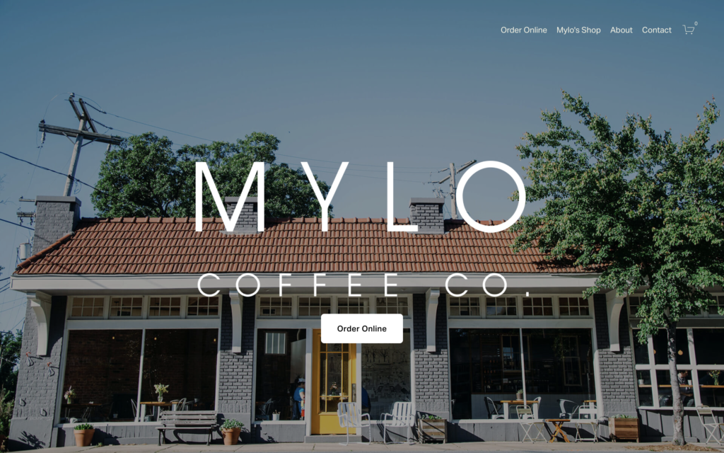
Mylo Coffee Company is a small coffee shop located in Scottsdale, Arizona. Their website features a photo of their physical front door right on the home page. The site’s design helps to turn website visitors into customers. One-third of the clickable elements on the home page take the customer to an order page. This is a clean site that doesn’t have any unnecessary elements.
California- Bru Coffee Bar
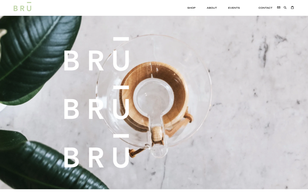
Bru Coffeebar is a female-owned coffee shop in Los Angeles, California. Their website makes good use of whitespace and light colors to give it a high-end feeling. This single-page site features fixed images that stay in place as you scroll to your heart’s content.
Colorado- Novo Coffee
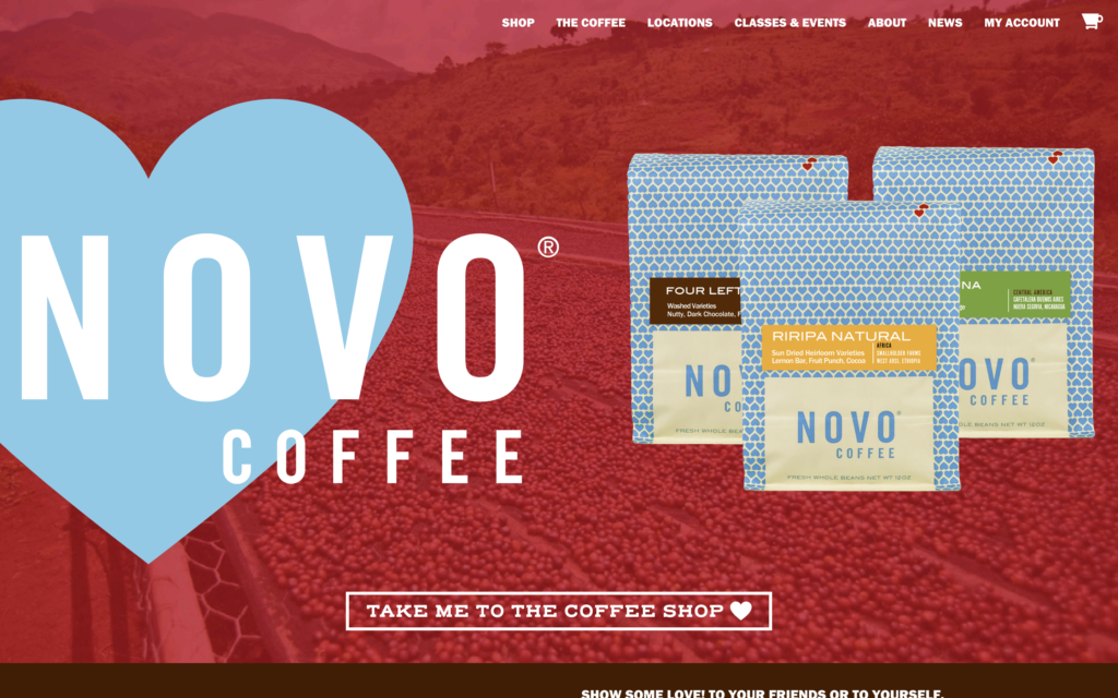
Novo Coffee is a Colorado-based coffee roaster on a mission to connect great coffee producers with coffee consumers. They currently have three Cafes throughout Denver. Their website keeps the important things (the coffee) front and center. It’s easy to navigate and it features one of the coolest loading animations that we saw on our whole journey.
Connecticut- Giv Coffee
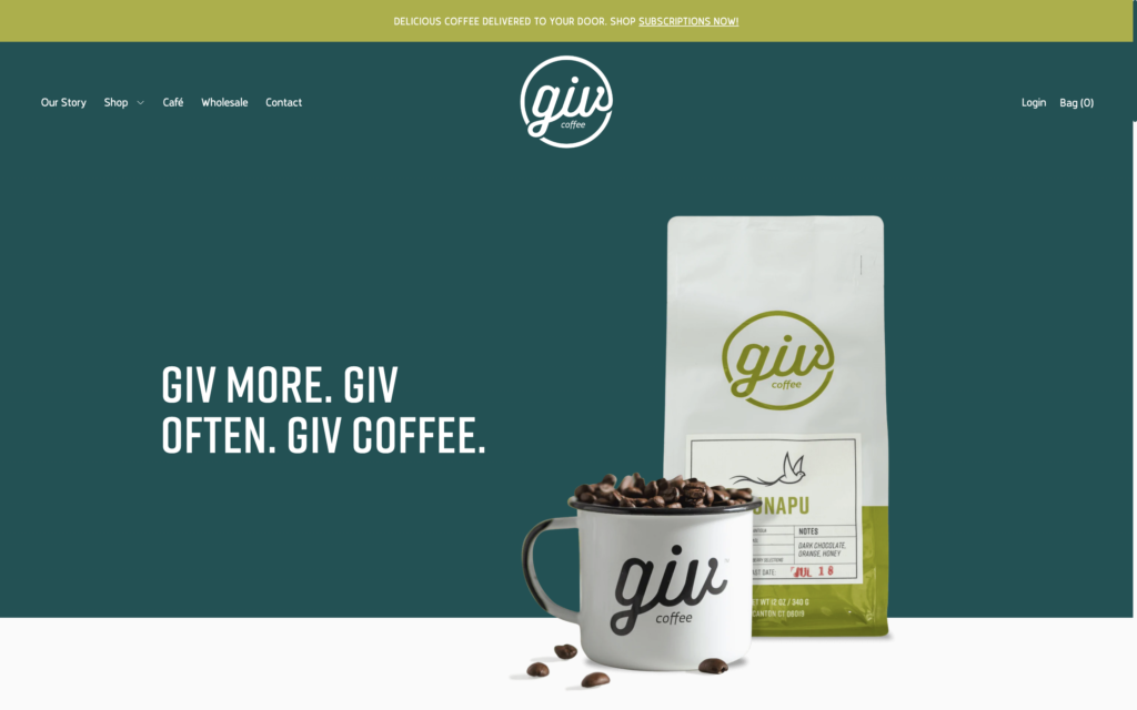
Giv Coffee is a roastery and cafe located in Canton, Connecticut. We love the cool blue-green color scheme on their site. On top of that, the way the coffee bag, mug, and beans overflow from the hero section to the next section makes you want to keep scrolling. It’s a great example of using some depth to make a website design more appealing.
Delaware- Bing’s Bake & Brew
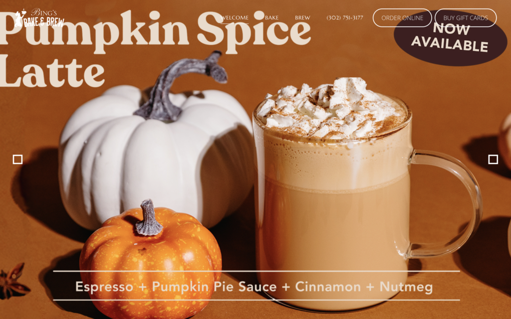
Bing’s Bake and Brew serves up award-winning specialty coffee drinks, espresso drinks, tea, and frozen beverages in Newark, Delaware. We love the hero section of their website. It features a couple of excellently designed images of their seasonal beverages that are made more engaging by the Ken Burns effect. It’s also a great idea to put an “order online” button right in the site’s header.
Florida- ALL DAY
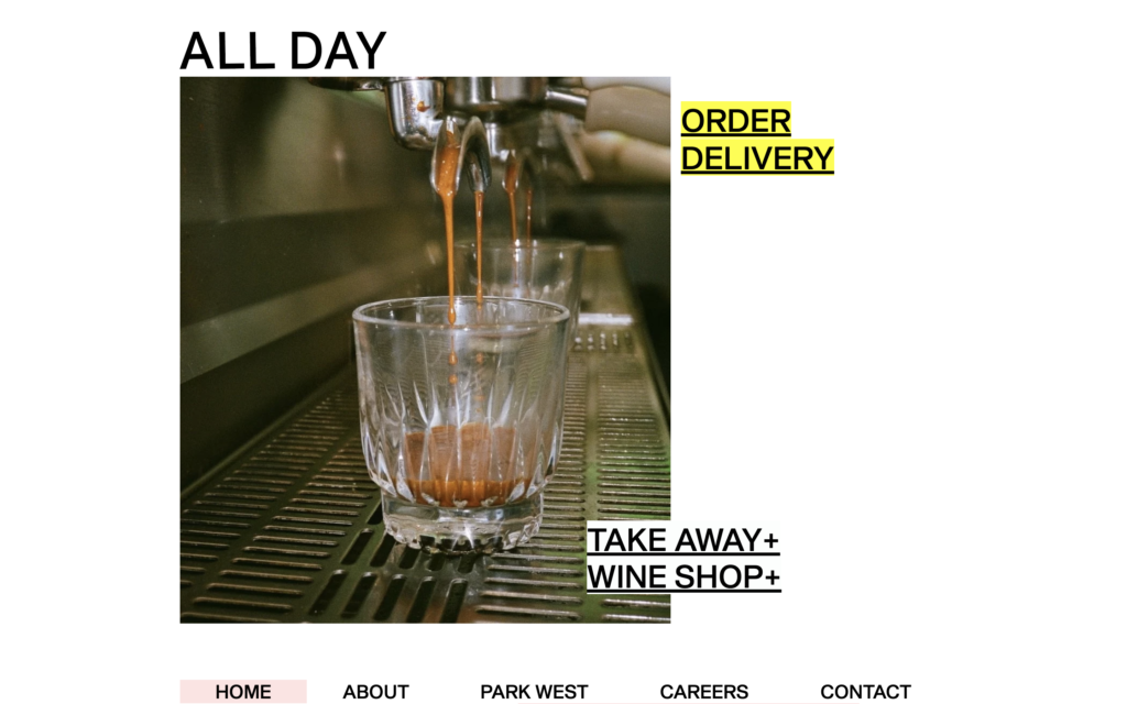
ALL DAY is an independent coffee bar and restaurant in the Park West neighborhood of Miami. Their website design is awesome. It combines the brutalist web design trend with bold colors that keep the main thing, the main thing. This is a great example of a unique design that’s straying from the beaten path if you want to do something more unique with your coffee shop’s website.
Georgia- Coffee Camper
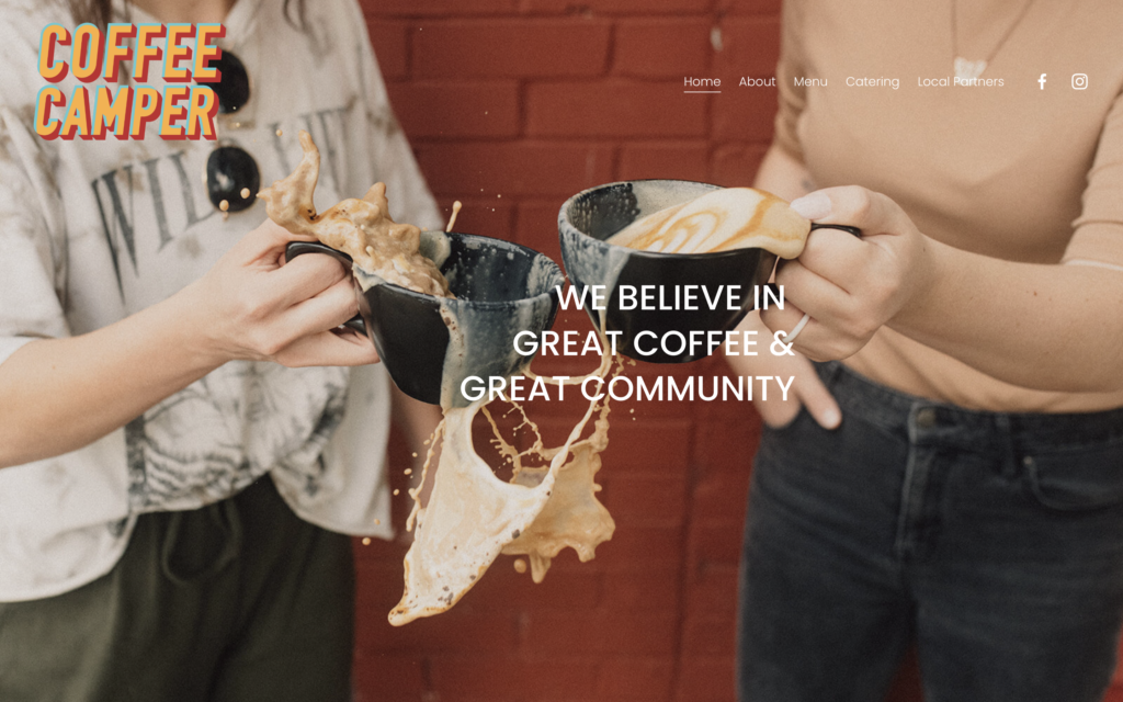
Coffee Camper is a coffee shop AND mobile coffee bar located in Monroe, Georgia. Right on their home page, you can see what they’re all about. The big, bold logo in the upper-left corner lets you know exactly where you are. We like that their headline offers their value proposition while the image of the splashing mugs shows that they don’t take themselves too seriously.
Hawaii- Little Fish Coffee
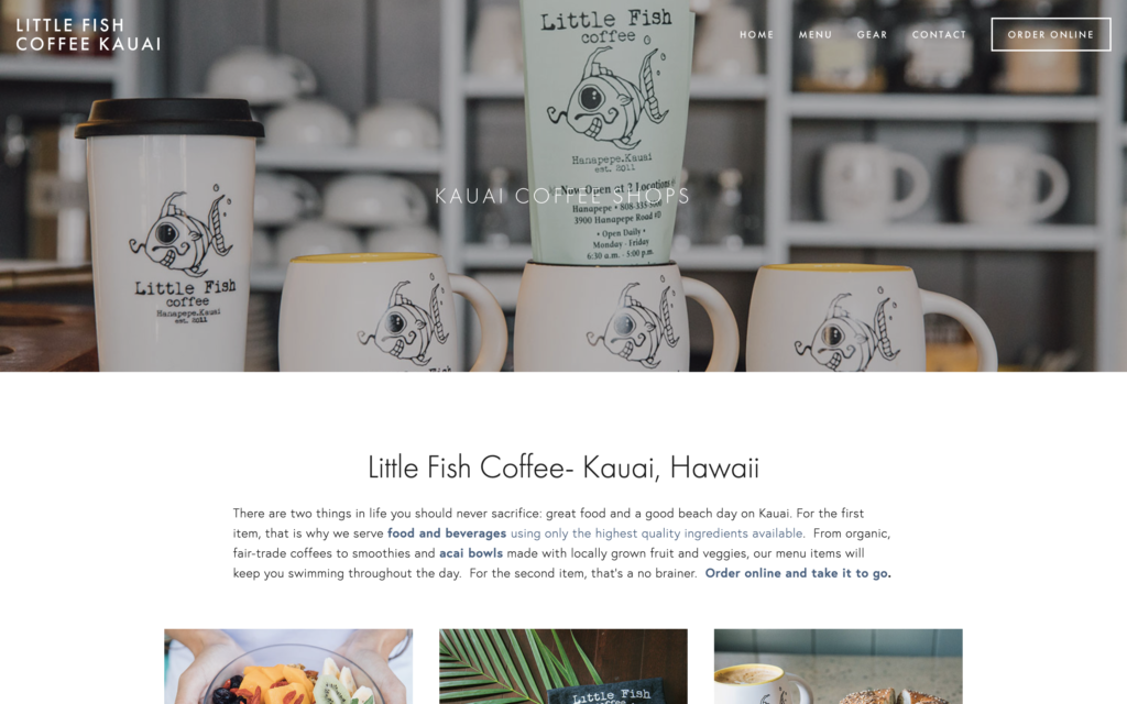
Little Fish Coffee is located on Kauai, Hawaii’s oldest island. The hero section of their website uses a classic layout where an image with an overlay takes up the page’s background and the header is centered in front of it. The most prominent item in the menu is the “order online” button. This helps ensure that more website visitors convert into coffee shop customers.
Idaho- Push & Pour
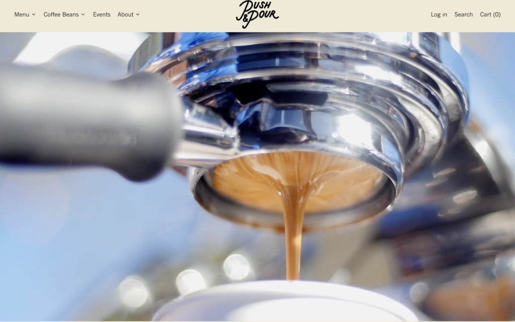
Push and Pour is a coffee shop with locations in Garden City and Boise, Idaho. The homepage of their website features a full-screen video that highlights the coffee, people, food, and events that make their shop so awesome. If a picture is worth a thousand words, a video is worth a million. Adding engaging videos to your coffee shop website is a great way to convert visitors into raving fans.
Illinois- Jeremiah Joe
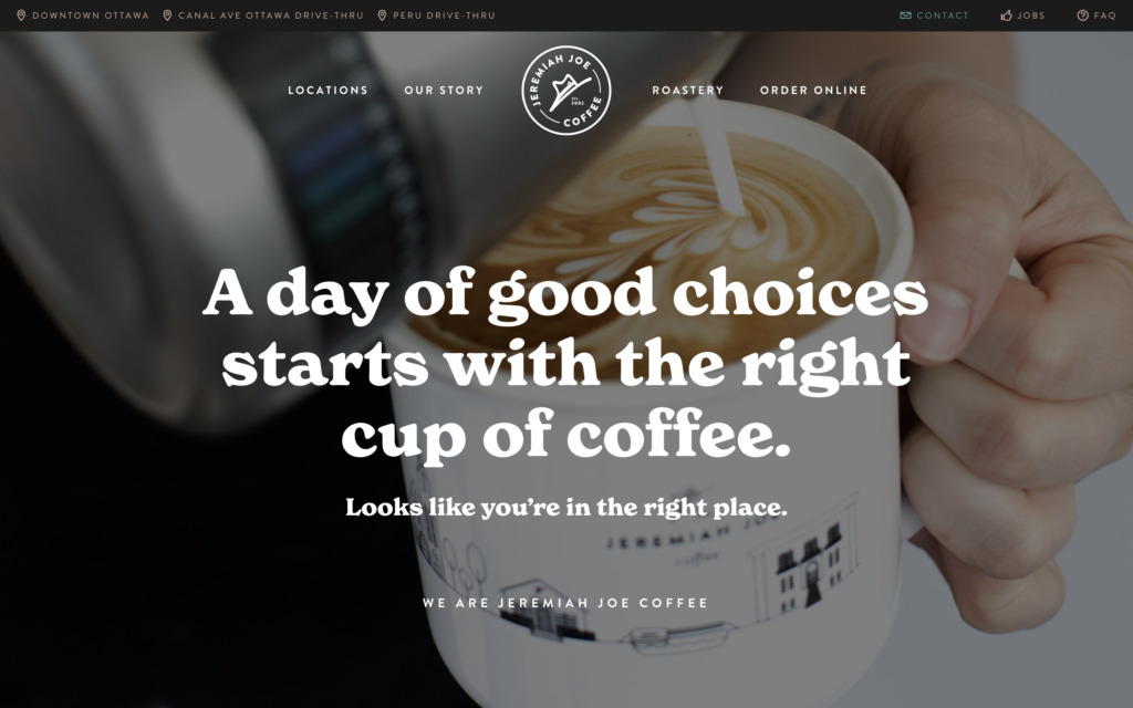
Jeremiah Joe Coffee has a string of coffee shops located in Ottowa and Peru, Illinois. The coffee shop’s website homepage uses playful fonts and colors to communicate the fun atmosphere that visitors experience when they visit the shop in person. Along with that, the copywriting on the site is A+.
Indiana- Georgia Street Grind
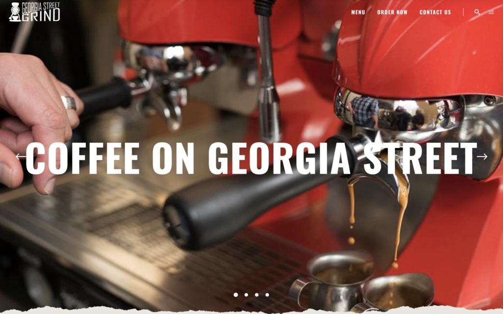
Georgia Street Grind is a coffee shop located in Indianapolis, Indiana. Their website uses bold and clever headlines to draw users in and explain what the shop is all about. The first headline you see on the site is “Coffee on Georgia Street.” This likely helps the coffee shop’s local SEO by making it easier for search engines and users to know exactly where the shop is located.
Iowa- Mars Coffee
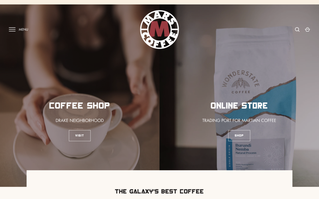
There are two main actions that most coffee shop owners want users to take when they visit the shop’s website: learn how to visit the shop or buy something online. Mars Coffee in Des Moines, Iowa has a website design that helps facilitate these actions perfectly. We love this site design because the two main actions are placed side-by-side right in the hero section. The copy throughout the website is pretty clever, too.
Kansas- Black Dog Coffeehouse
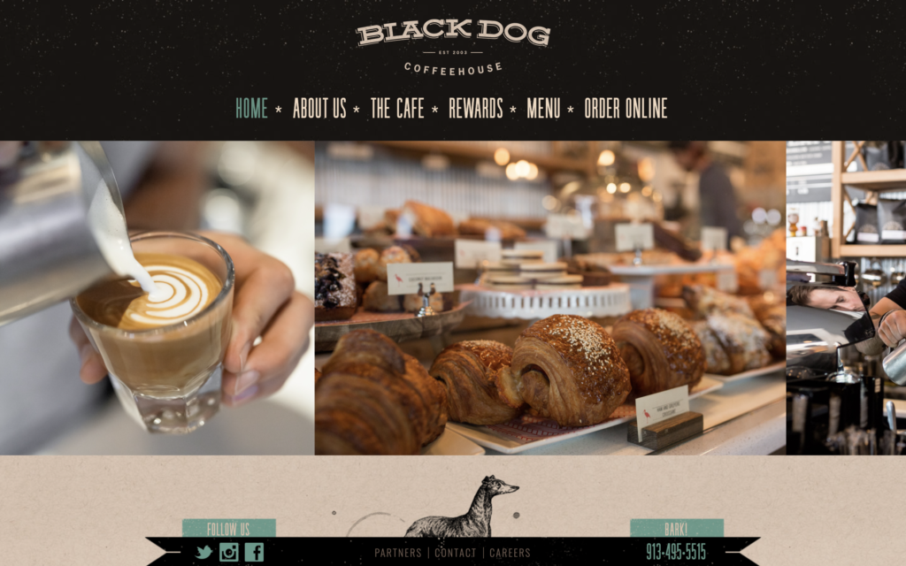
Black Dog Coffeehouse is located in Lenexa, Kansas. Their shop serves delicious coffee and baked goods to a wide variety of customers. Their website design makes excellent use of photography across the site. Website visitors can get a good feel of what the physical shop is like just by clicking around the website and looking at the pictures. Solid execution from Black Dog.
Kentucky- Heine Brothers
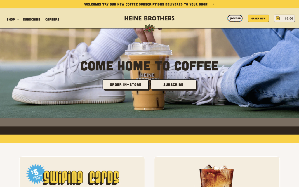
Heine Brothers Coffee is a Louisville-based chain with over 15 locations in the area. The business aims to operate in a way that results in treating people and the planet with respect and dignity. Their website design uses elements of neubrutalism web design that keep the site feeling trendy and updated. The site features a handful of helpful call-to-action buttons that ensure users are taking valuable action.
Louisiana- Tamp & Grind
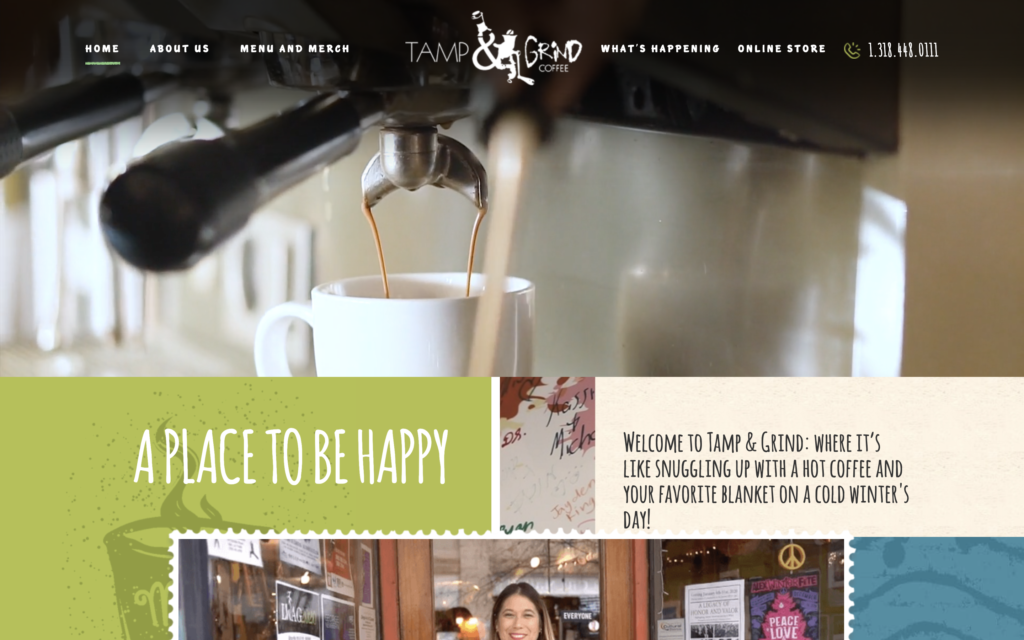
Tamp and Grind is a coffee shop located in Alexandria, Louisiana. Their website uses video in a couple of different ways right on the homepage. The background of the hero section is a silent video of b-roll from around the coffee shop. As you scroll down, you’ll see another simple video that tells visitors more about the coffee shop. This site is another example of how engaging video can be in website design, and it doesn’t have to be complicated.
Maine- Tandem Coffee Roasters
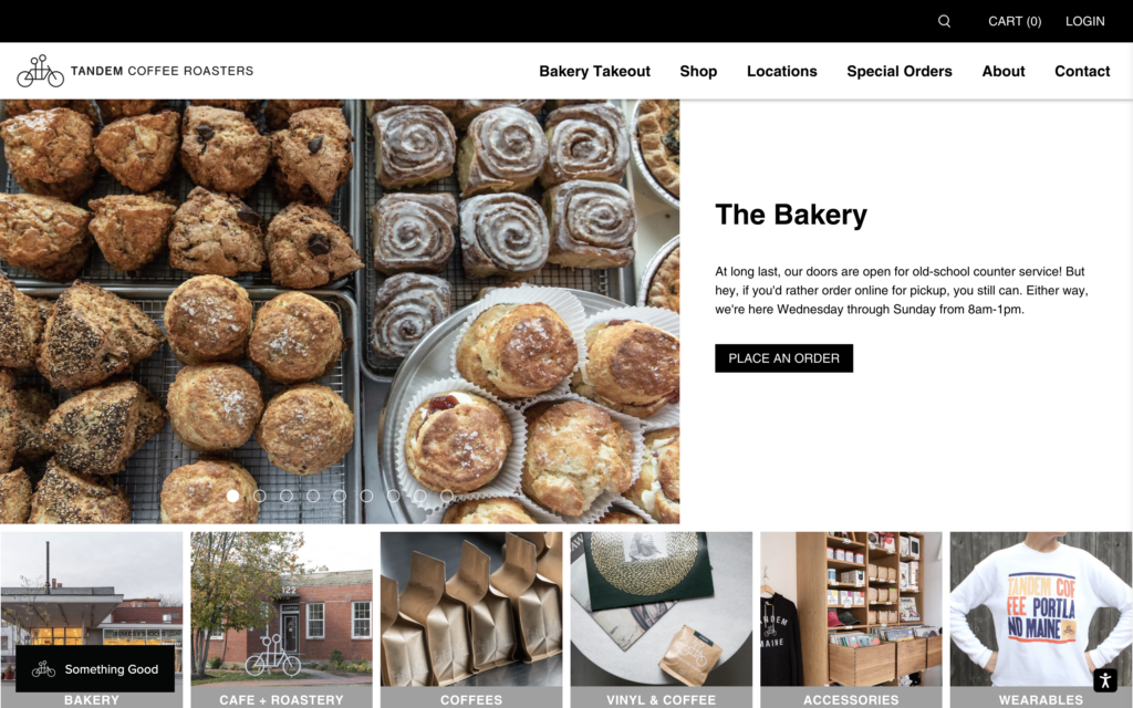
Tandem Coffee Roasters has two locations in Portland, Maine. The hero section of their site scrolls through multiple different images, headlines, and call-to-action buttons. This feature allows the site to appeal to different types of visitors without even making them scroll.
Maryland- Rise Up
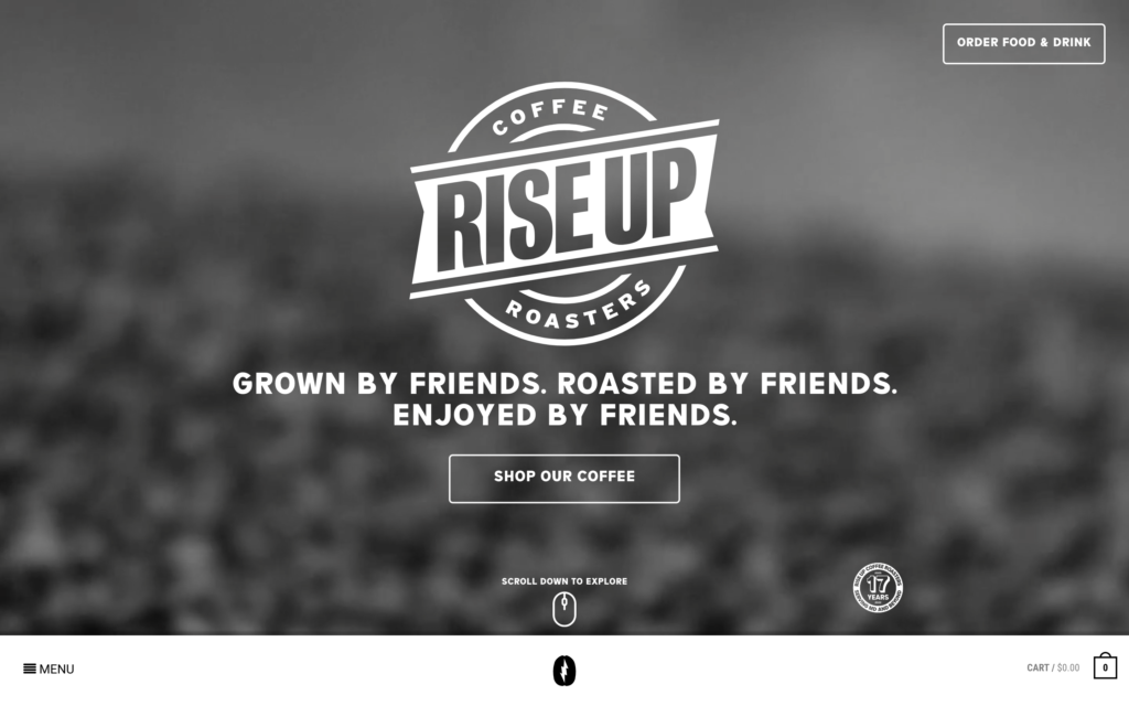
Rise Up Coffee Roasters has been serving up their coffee to Maryland residents since 2005. Their website has some awesome design features. On their homepage, the menu and cart are uniquely located at the bottom of the screen. One of the coolest pages on the site is their locations page, which features hand-drawn illustrations of each of their locations. The site’s full-screen menu is pretty sweet, too.
Massachusetts- Gracenote
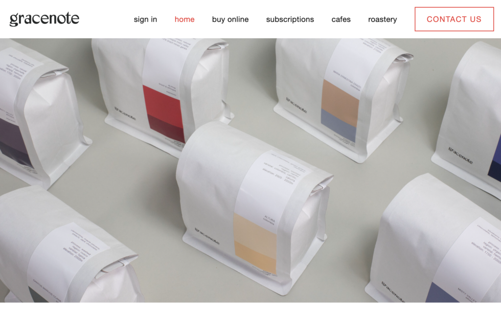
Gracenote Coffee is a coffee roaster with three cafes located in Boston, Massachusetts. Their website has a remarkably clean design that highlights their products and their locations. The site uses a bright red accent color that adds emphasis to the website’s most important pieces. The site is also an example of how great photography can elevate a company’s online presence.
Michigan- Strange Matter
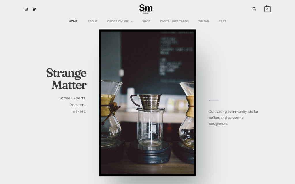
Strange Matter Coffee has two coffee shop locations in Lansing, Michigan. They have a really clean website that stands out among other coffee shop websites. We love how they’ve laid out the hero section and kept whitespace a priority. Every element on the website has room to breathe and that makes it really easy on the eyes.
Minnesota- Dogwood Coffee
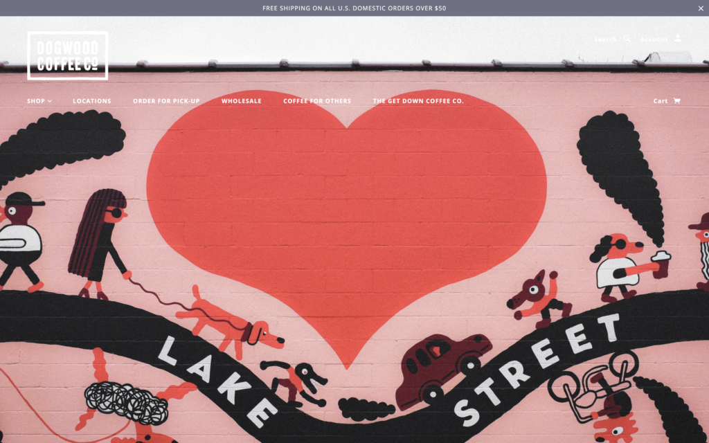
Dogwood Coffee Company has three shops located in Saint Pual and Minneapolis, Minnesota. When it comes to their website, you can tell that they’re all about brand consistency. The colors and imagery that they use in their shop, on their packaging, and on their website are all aligned. It’s always a great idea to feature a photo of your physical shop like Dogwood did here with the mural on the side of their building.
Mississippi- Cups Espresso Cafe
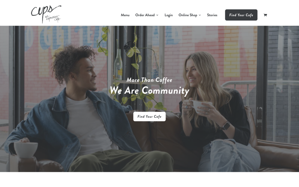
Cups Espresso Cafe is a Mississippi-based chain of cafes. There are a few different things we really like about their website. The first is that they feature a picture of real people drinking real coffee as the first thing a visitor sees. As you scroll down, you’ll see a list of six things that Cups assures you you’ll encounter at their cafes. Unique selling propositions like these are a great way to differentiate your coffee shop from the competition.
Missouri- Oddly Correct
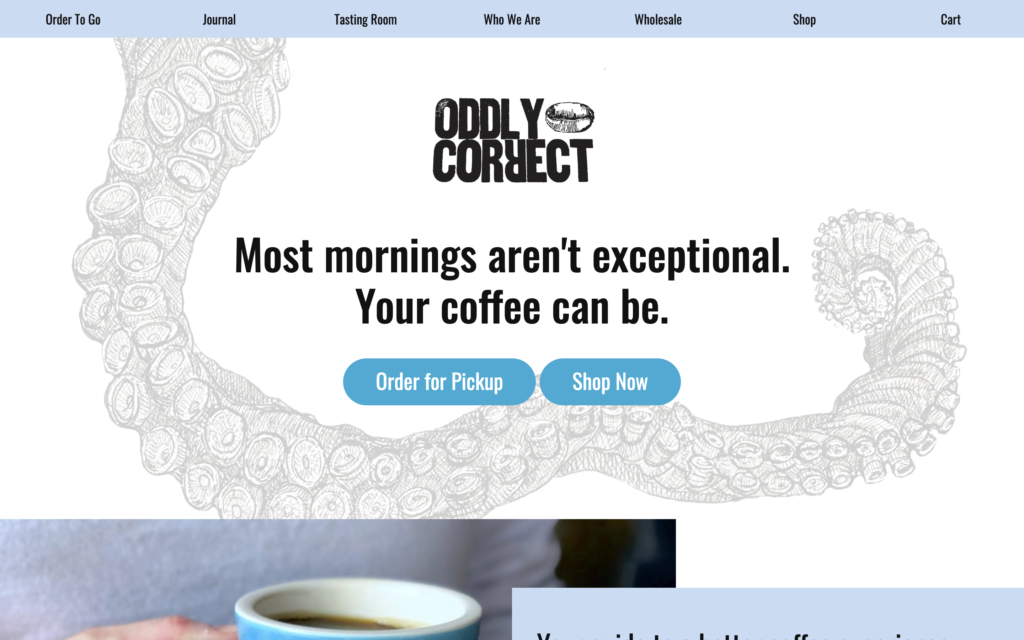
Oddly Correct is a coffee shop located in Kansas City, Missouri. They’re working to create a context for people to discover and appreciate coffee as a unique and wonderful beverage while striving for equity for all who work to bring coffee from seed to cup. We love the layout of the design elements on their site. It adds depth that’s really satisfying to look at. On top of that, they have the two classic coffee shop call-to-action buttons front-and-center. This is a solid coffee shop website design to take inspiration from.
Montana- The Daily
Nebraska- Rally Coffee Co.
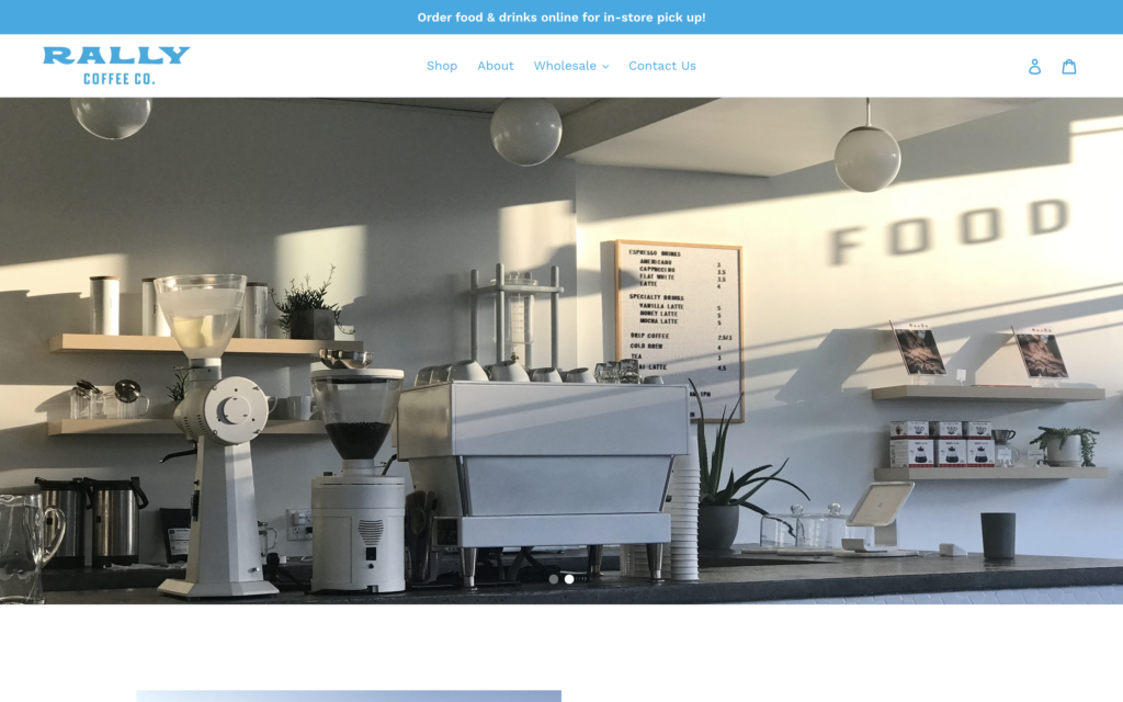
Rally Coffee Co. is a coffee shop located in downtown Omaha, Nebraska. Their website does an excellent job of showing off the shop’s clean aesthetic. Something we really love about the website is that its Google Maps location is right on the homepage. There’s also an info box on top of the map that tells visitors the shop hours and lets them know that parking is free. This is a great example of giving users exactly what they’re looking for when they visit a coffee shop website.
Nevada- Sunrise Coffe
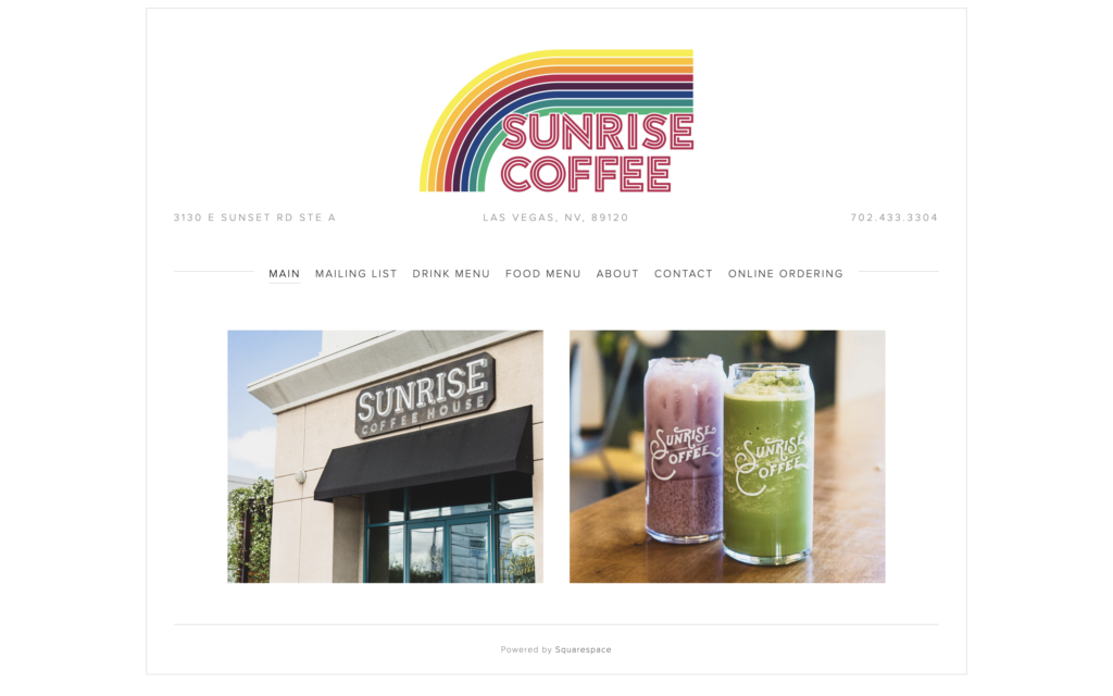
Sunrise Coffee is located in Las Vegas, Nevada. We appreciate how their website gives prominence to their colorful logo without neglecting the other important elements of the site. Everything a website visitor would be looking for can be found on the navigation menu. From the food menu to online ordering, Sunrise Coffee covered all the bases here with its minimalist design.
New Hampshire- Mad River
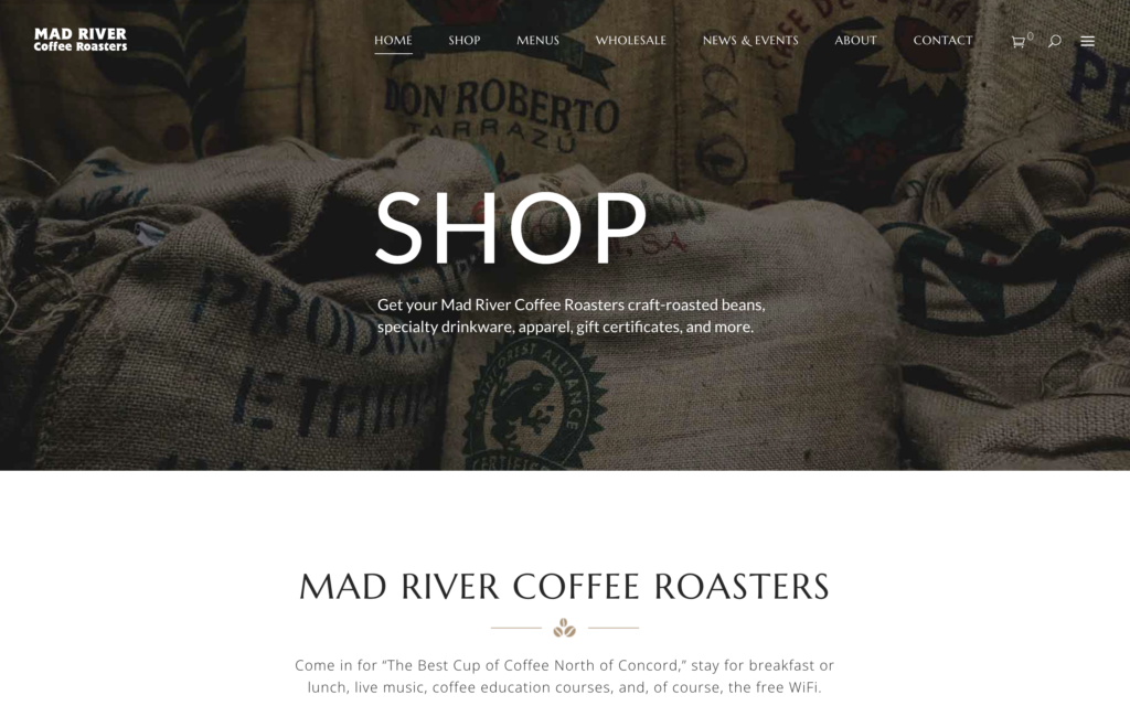
Mad River Coffee Roaster has a coffee shop located in Campton, New Hampshire. One of the more unique things about their coffee shop website is that they feature customer reviews on the homepage. This provides social proof that may push website visitors over the edge and make them want to visit the shop in person.
New Jersey- The Airport Cafe
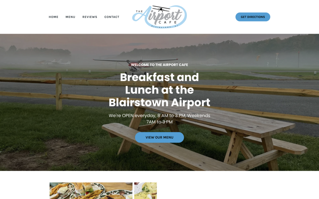
As you probably imagined, The Airport Cafe is located at an airport. The airport is in Blairstown, New Jersey. This website does a great job of highlighting what makes the coffee shop unique. Visitors can sit there and watch the airplanes take off and land. The imagery on the website accurately communicates what the experience of visiting The Airport Cafe is like.
New Mexico- Plata
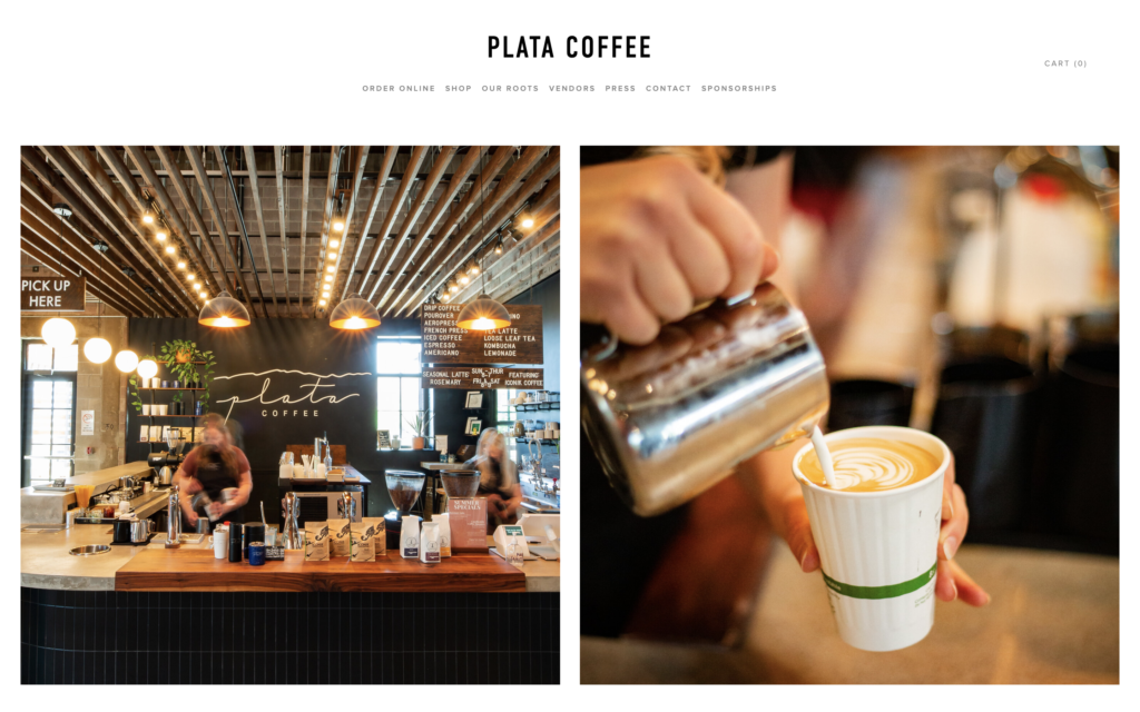
Plata Coffee is a local coffee shop located in Albuquerque, New Mexico. Their website’s homepage features some beautiful side-by-side photographs from the coffee shop. As you scroll down, you can find all the basic information that you’d want to find on a coffee shop website: the hours, the address, and the menu. We dig this no-nonsense site.
New York- Sweatshop
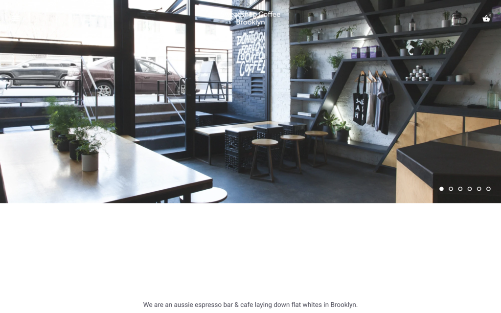
Sweatshop Coffee is a cool coffee shop located in Brooklyn, New York. We know that coffee shop owners and managers obsess over the atmosphere of their shops. That’s why it makes sense when that atmosphere is highlighted on the shop’s website. Sweatshop’s website does an excellent job of conveying the atmosphere of their shop through the professional photography used on their site.
North Carolina- Coco and the Director
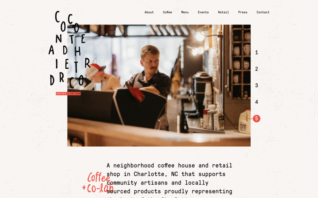
Coco and the Director is a neighborhood coffee house in Charlotte, North Carolina. Their coffee shop website is pretty remarkable. It’s interactive and easy on the eyes. The logo on the lefthand side of the screen condenses as you scroll. Additionally, the website has an interesting textured background which is a cool break from the usual all-white backgrounds that we see on a lot of sites. You can also tell that this business is focused on their local SEO based on the keywords found throughout the site. This is a great website to look to for inspiration.
North Dakota- Youngblood
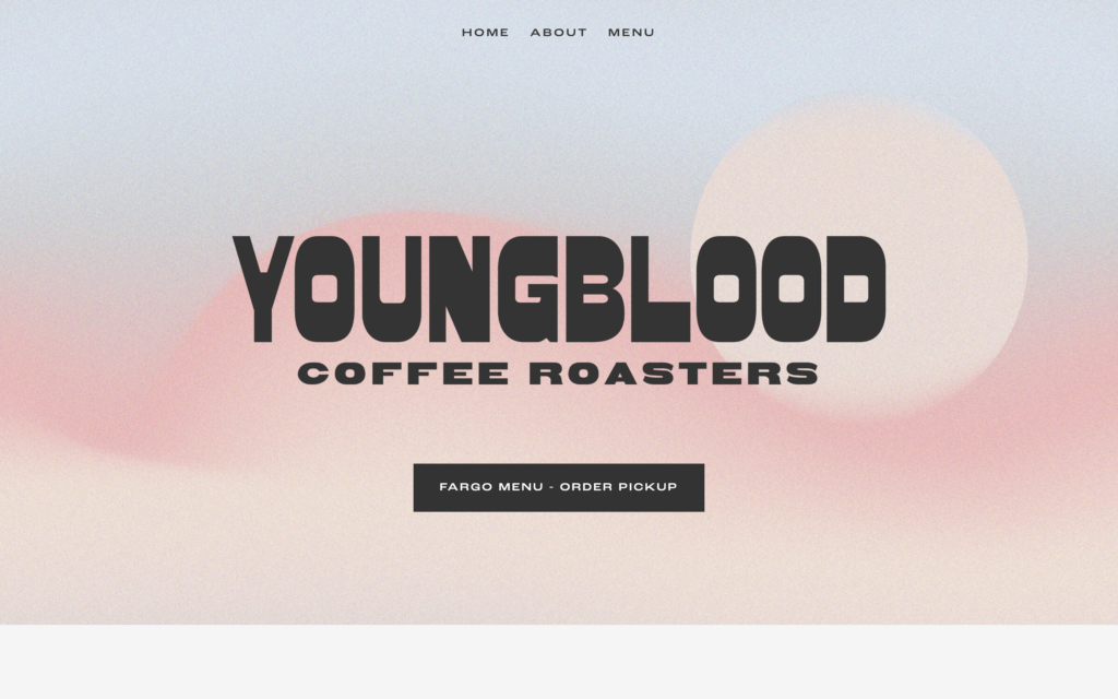
Youngblood Coffee Roasters is located in Fargo, North Dakota. Their coffee shop website is good-looking and straight to the point. When the homepage loads, there is one simple call to action– order pickup. This site design removes a lot of the elements that could distract someone from placing an order. Bonus points for the cool grainy gradient background.
Ohio- Brioso
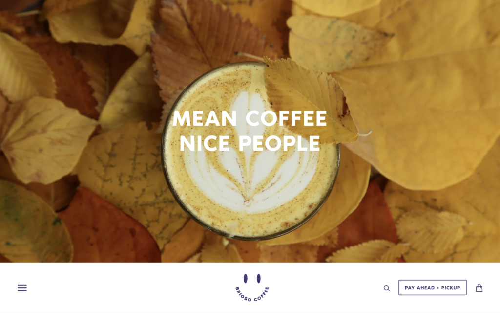
Brioso Coffee’s flagship store is located in downtown Columbus, Ohio. There are a lot of things we love about this coffee shop’s website design. This is another example of a site that features the main navigation menu at the bottom of the homepage when it loads. The rest of the website features a fun color palette, clever copy, and exceptional product photography of their beverages.
Oklahoma- Classen
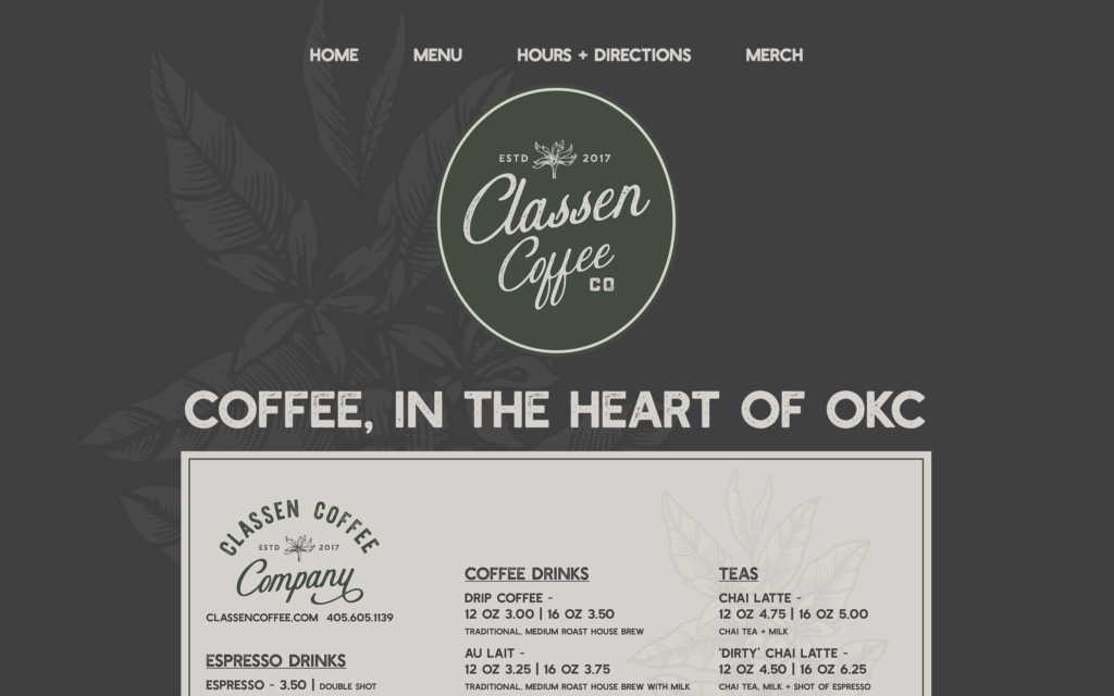
Classes Coffee Company is a coffee shop in Oklahoma City, Oklahoma. There does a great job of getting straight to the point. Based on the headline on the homepage, Classen a business-savvy coffee shop that’s taking advantage of local SEO. One thing we really like about the site is its fixed background. It makes the pages really fluid as you scroll through the different information about the coffee shop. This is a design feature that is definitely worth considering for your shop’s website.
Oregon- Never
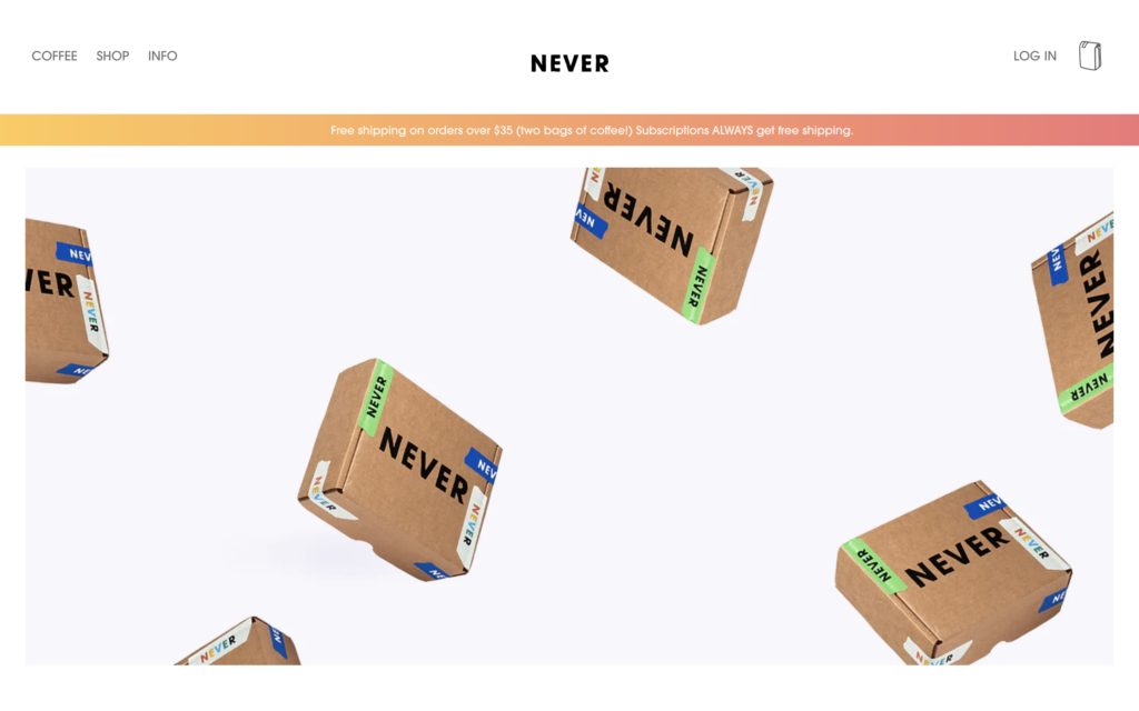
Never Coffee Lab is a coffee roaster with cafes in Portland, Oregon. Never has set up a great e-commerce website. It highlights the product exceptionally and has subscription functionality to help make it more profitable. The info page shares the hours for each coffee shop as well as directions to get there. This is a really cool website overall.
Pennsylvania- Espresso a Mano
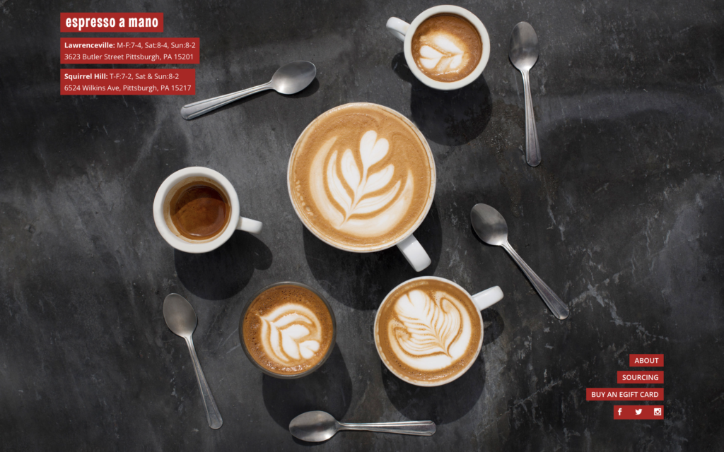
Espresso a Mano has two coffee shops in Pittsburgh, Pennsylvania. This coffee shop website is awesome. In the top left corner, you can find all the important information about both coffee shops. The hours and address are right there. The navigation buttons are in the bottom right corner which helps to frame the slideshow of excellent photography in the background.
Rhode Island- Mainstreet Coffee
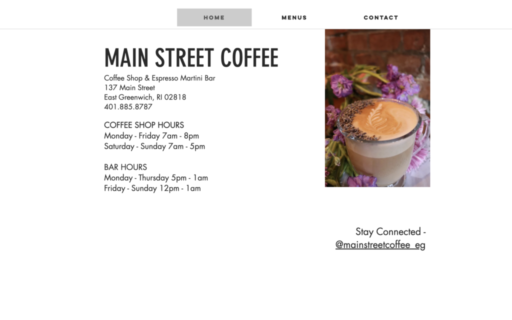
Mainstreet Coffee is a coffee shop and espresso martini bar in East Greenwich, Rhode Island. Mainstreet Coffee is another shop that opted for a minimalist website design. This website is free of any unnecessary elements and it tells visitors what they want to know quickly and easily. It also features a really clean side-scrolling animation as you move between pages.
South Carolina- Indah
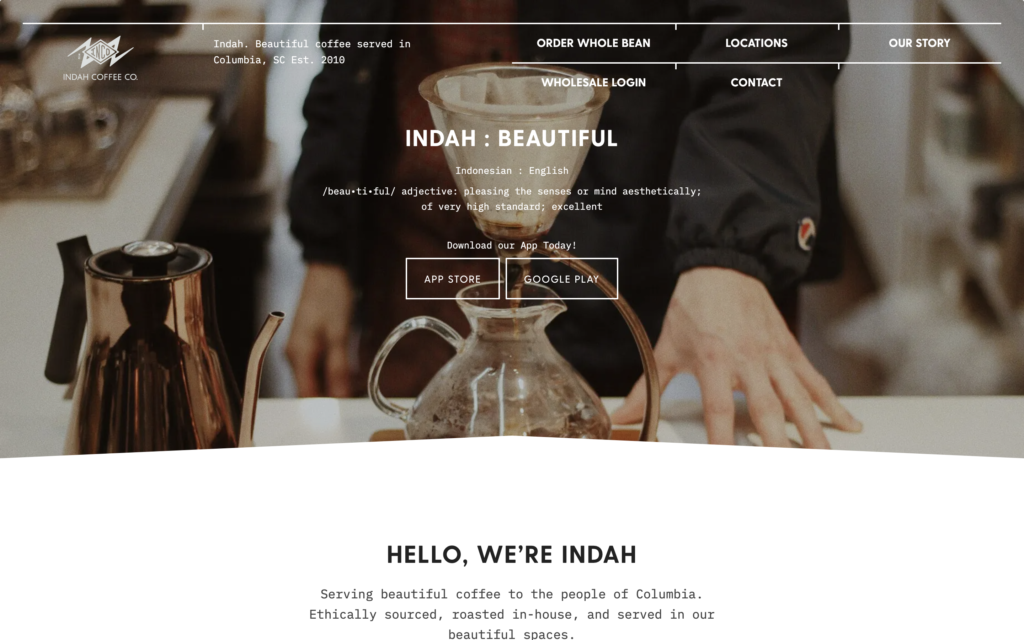
Indah Coffee has been serving coffee in Columbia, South Carolina since 2010. The coffee shop’s website features some beautiful photography from around the shop. One of the really unique things about the site is the call pair of call-to-action buttons at the center of the homepage. The buttons prompt visitors to download Indah’s mobile app. While this isn’t the CTA we usually see, it can be a very valuable action that will likely drive lots of revenue down the road.
South Dakota- Dixon Coffee
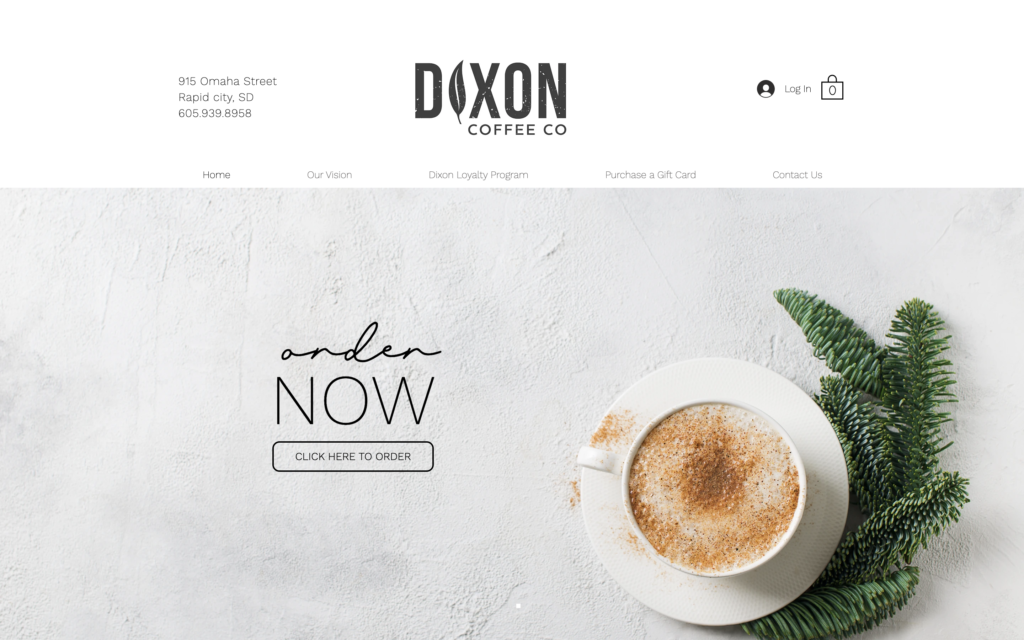
Dixon Coffee Company is a coffee shop in Rapid City, South Dakota. Dixon’s coffee shop website is bright and clean. The website design features intentional typography that conveys the calm and clean atmosphere of the coffee shop’s physical location. The use of whitespace in the background image to highlight a call-to-action on the hero section was a great move.
Tennessee- Barista Parlor
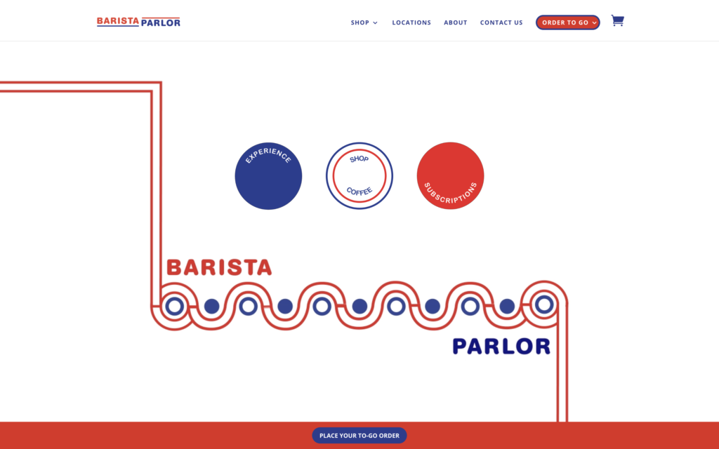
Barista Parlor is a Nashville, Tennessee-based coffee shop with eight locations throughout the city. For their coffee shop website, they opted for a vibrant red, white, and blue color scheme. There are a lot of cool and unique things about this site. The three buttons in the center of the homepage are creative and unconventional. On top of that, the funky background animation that happens as the shop’s name is revealed is one-of-a-kind.
Texas- Cuvee
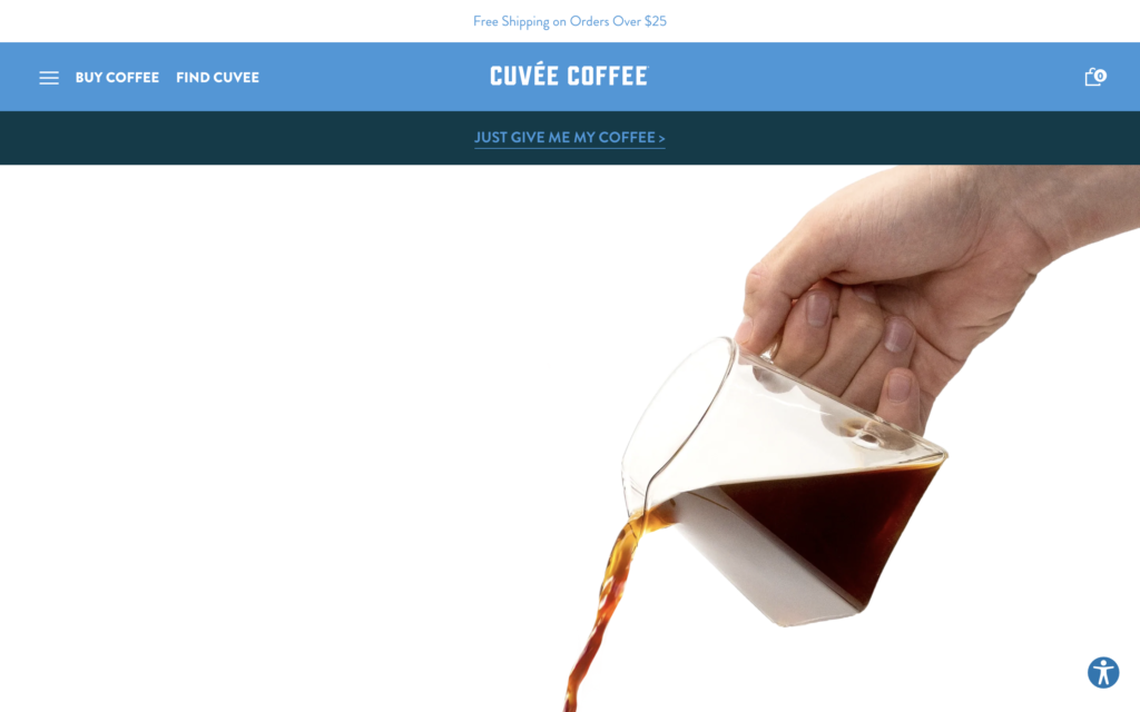
Cuvée Coffee is a coffee roaster and coffee bar located in Austin, Texas. Cuvee’s website has some of the most engaging copy that we found on our virtual journey to all these coffee shops. The copy comes in big, bold headlines. Often, the headlines enter the page via an eye-catching animation that grabs your attention. Be sure to check this site out if you’re looking for some inspirational coffee copy.
Utah- Blue Copper
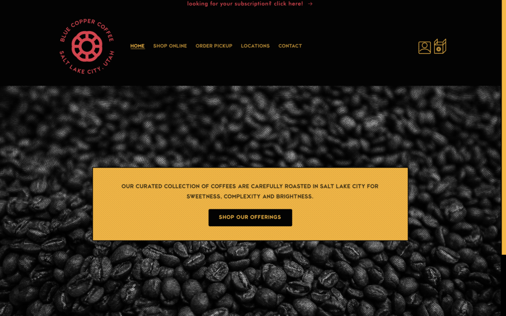
Blue Copper Coffee is a Salt Lake City coffee roaster that has two coffee shops within the city. Their website is darker than many that we’ve seen so far. It’s an interesting change compared to other coffee shops. One cool feature of their site is that nearly every clickable element has some time of animation attached to it. This makes for an engaging site that is fun to navigate.
Vermont- Mocha Joe’s
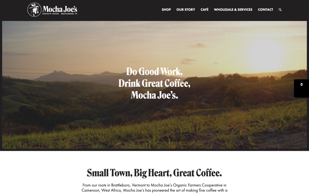
Mocha Joe’s Specialty Coffee is a coffee roaster and cafe located in Battleboro, Vermont. Mocha Joe’s website is beautifully designed with excellent photography and a simple color palette. The information on their cafe page includes all the essentials that you’d want to see on a coffee shop website. We’re big fans of the use of primary colors throughout this website.
Virginia- Roast Rider
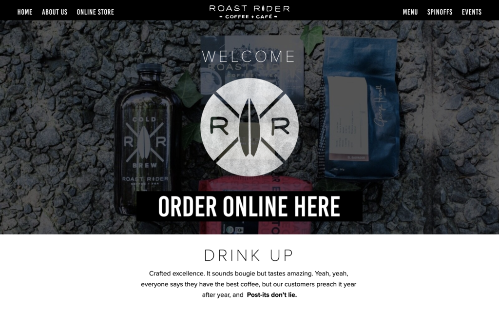
Roast Rider Coffee is based in Virginia Beach, Virginia. Roast Rider’s website has all the essential pieces that normally make up a coffee shop website. One unique piece of their website design is how they display customer testimonials. If you scroll down on their homepage, you’ll see an image slideshow of photos of different reviews that customers have written on sticky notes. This unconventional feature humanizes every review and provides great social proof for people thinking about visiting the shop.
Washington- Woods Coffee
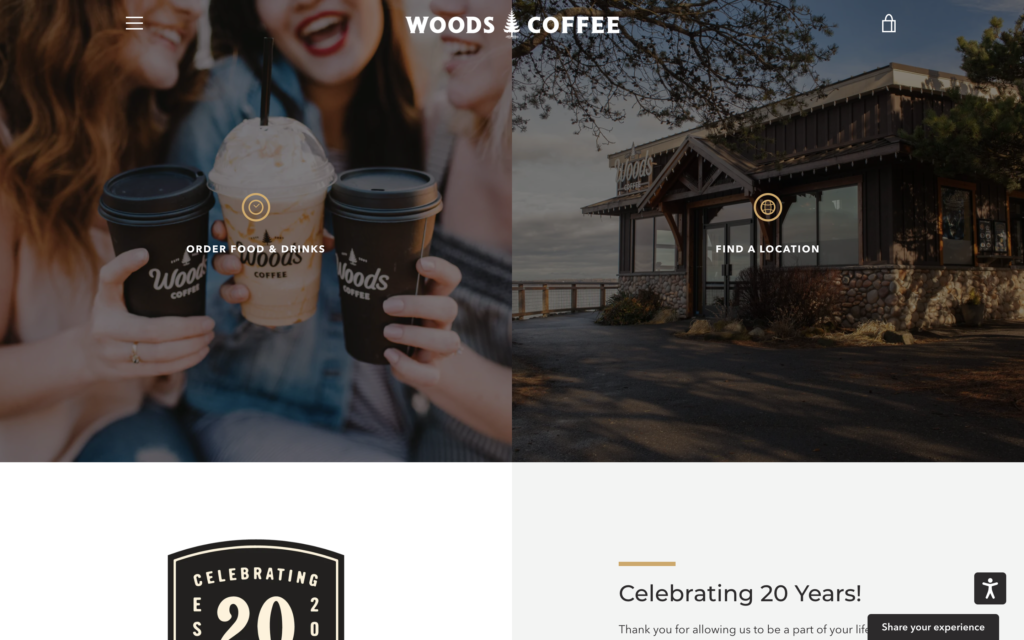
Woods Coffee is a premier coffee chain in the Pacific Northwest, with coffee shops throughout northwestern Washington. The Woods Coffee website couples fantastic photography with two valuable calls to action in the hero section. Getting people to place an order and walk through the doors are two of the main goals of a coffee shop website, so it makes sense to make both of those things easy for visitors to do.
West Virginia- The Blue Moose Cafe
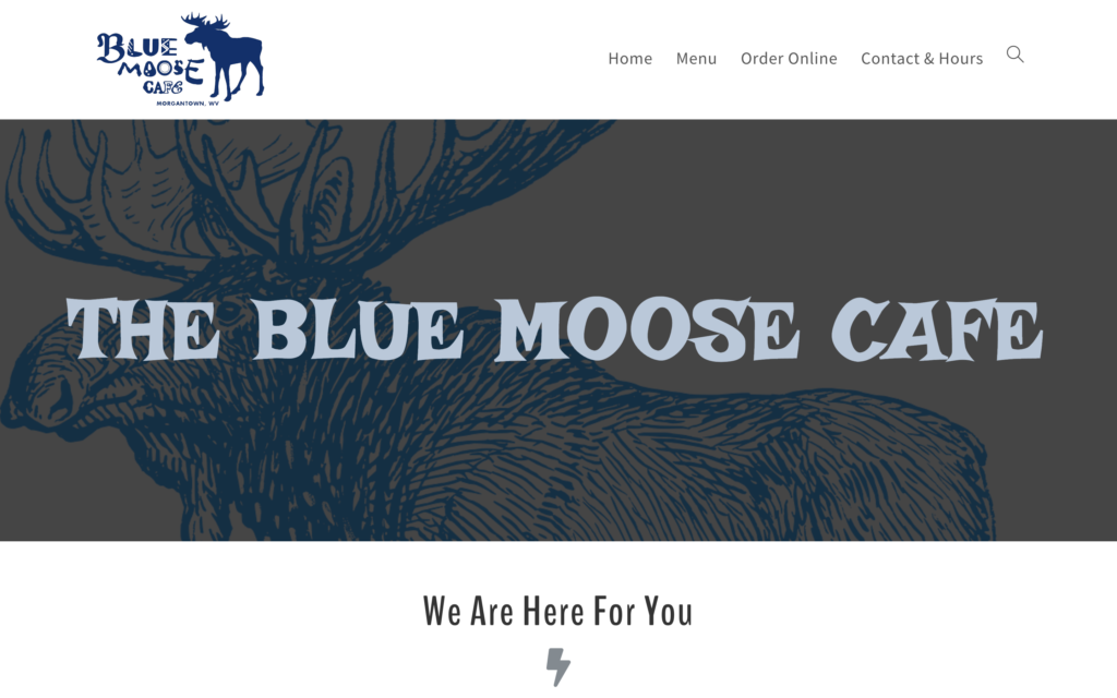
The Blue Moose Cafe is a coffee shop located in Morgantown, West Virginia. Their coffee shop website uses simple iconography and organization to easily communicate what they’re all about. One of the most important pieces of their homepage is the “Location” section where visitors can see exactly where the shop is on a map. The section also includes contact information in case people have any questions.
Wisconsin- Canary Coffee Bar
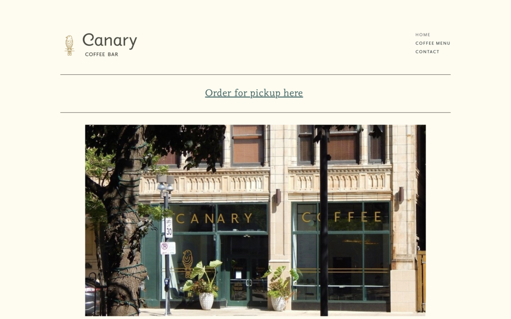
Canary Coffee Bar is a coffee shop located in Milwaukee, Wisconsin. The shop’s website has a simple and elegant design that leaves out any unnecessary features. Since many people who land on a coffee shop website are simply trying to figure out how to get to the shop, including a photo of the outside of your shop can be incredibly helpful for visitors. This is a great move that can help you convert more website visitors into in-person visitors.
Wyoming- Cowboy Coffee
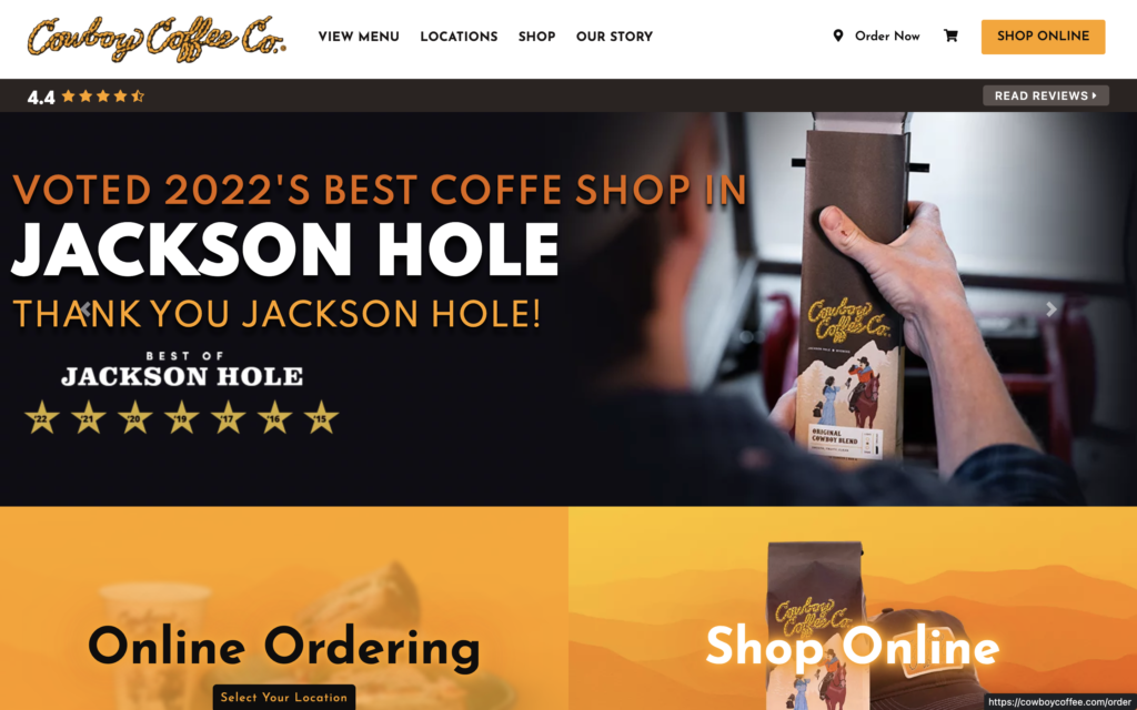
Cowboy Coffee Company has two coffee shop locations in Jackson, Wyoming. Cowboy Coffee’s website is great. It pays homage to the region of the country where it’s located. Everything from the colors to the imagery is a nod to the west. On top of that, you can tell that the coffee shop is trying to take advantage of local SEO. In a high-traffic and touristy area like Jackson Hole, the top spots in the Google search results are likely worth thousands of dollars every year.
Let Marketing Backend help with your coffee shop website design
Now that you’ve seen how coffee shops across the country have designed their website, we’re sure you’ve found some inspiration. Whether you want to put your own spin on some ideas you’ve seen here or want to try something completely different, we’re here for you! We have a passion for the coffee shop industry and years of web design experience. Let us bring your vision to life.
Digital marketing services and solutions
Marketing Backend offers a full suite of digital marketing services and solutions to help your coffee shop grow. On top of that, all of our offerings are accessible through your own customized platform. This platform allows you to manage your coffee shop’s entire online presence in one place.
